Synesthesiac nourishment in pursuit to create identity.
A chat with Chloé Pannatier.
Artwork: an amplification of expression in the form of a travelling vehicle to resonate in what you are perceiving and making it travel further to communicate more powerfully with an audience. Essential to contextualise or for story telling, artwork is to capture the identity and act as the physical embodiment of a message. The prominence and activity within the digital realm, on and offline, over the past decade has brought with it a steady shift in the origins of artwork design whereas its necessity may not always be universally understood let alone appreciated.
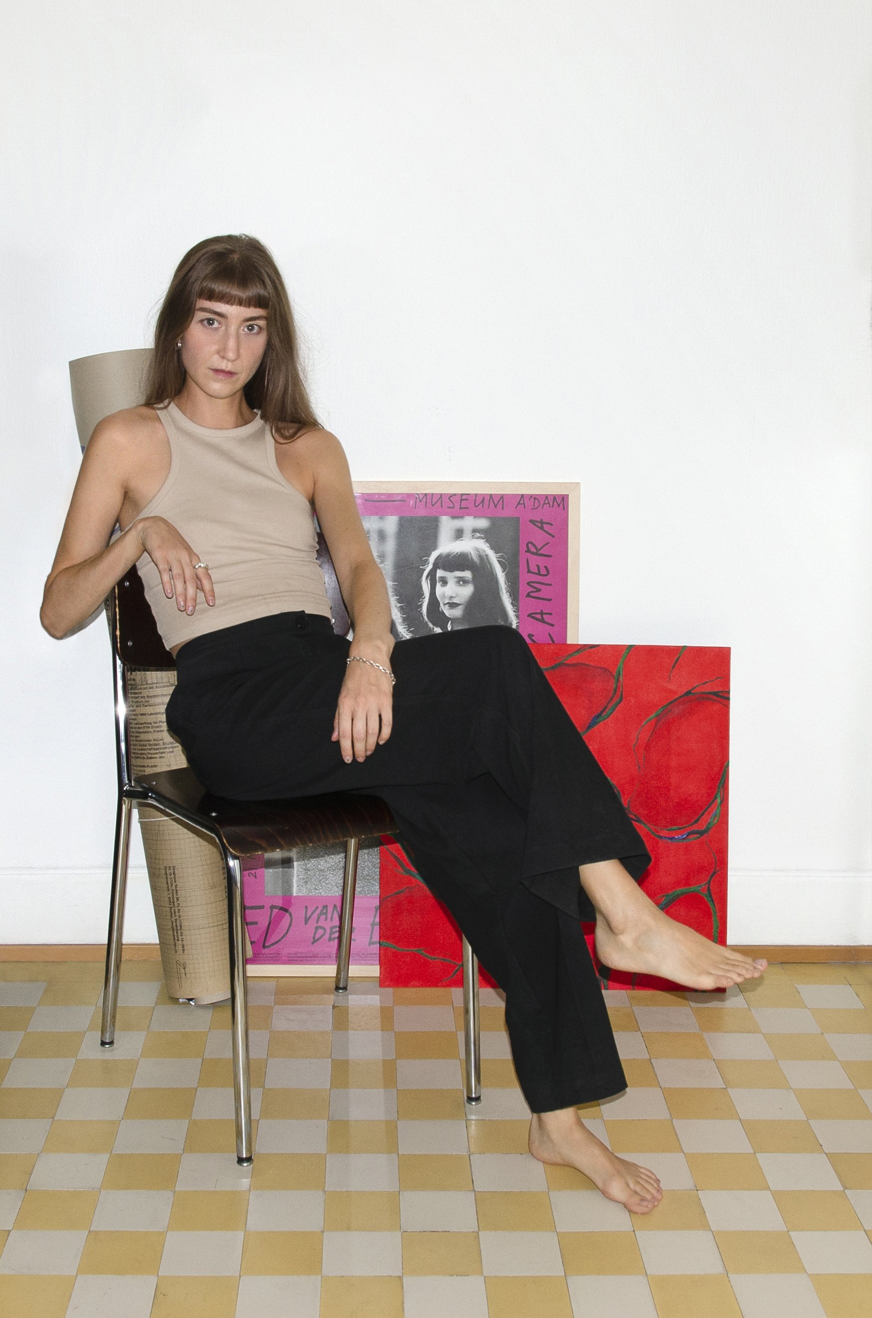
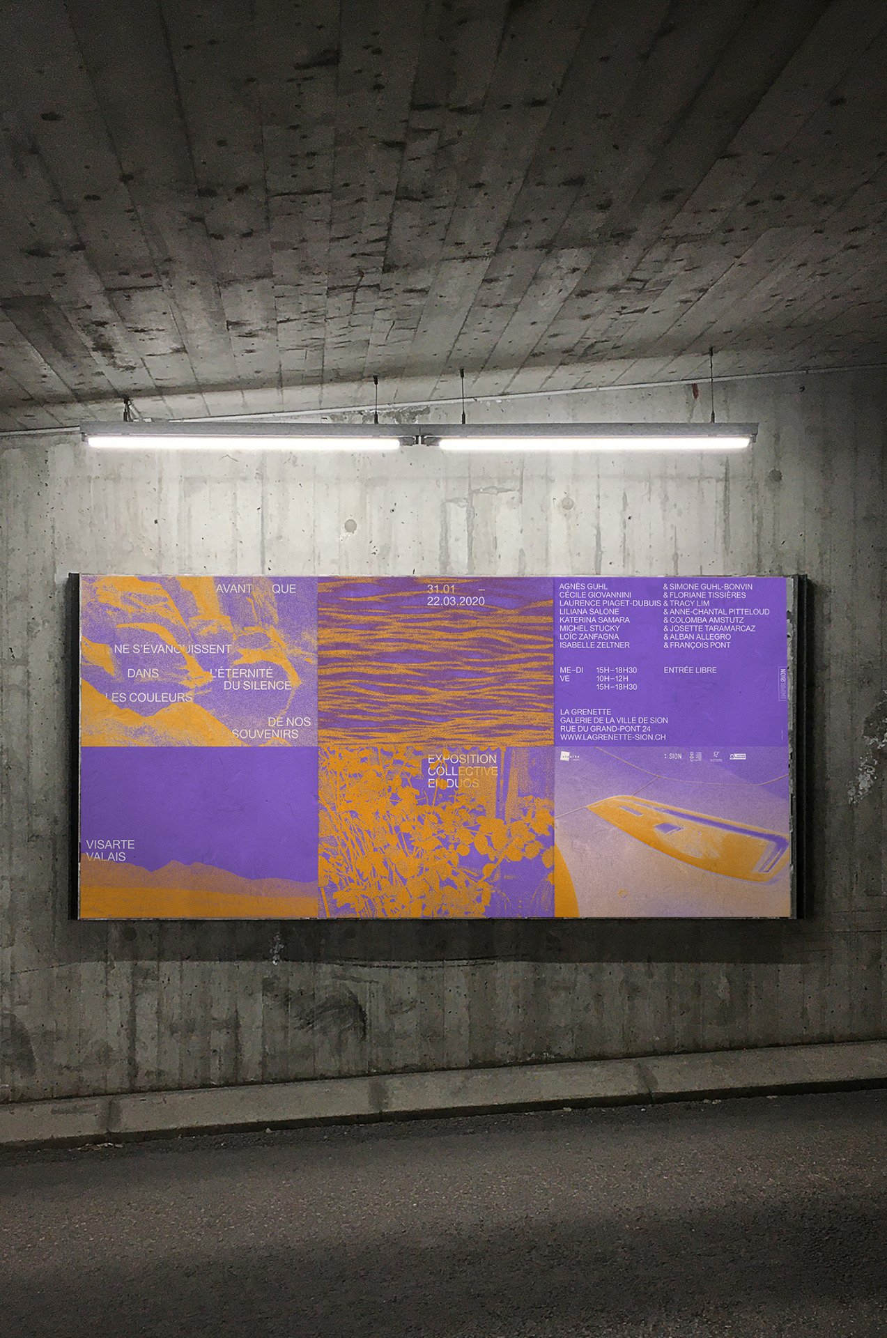
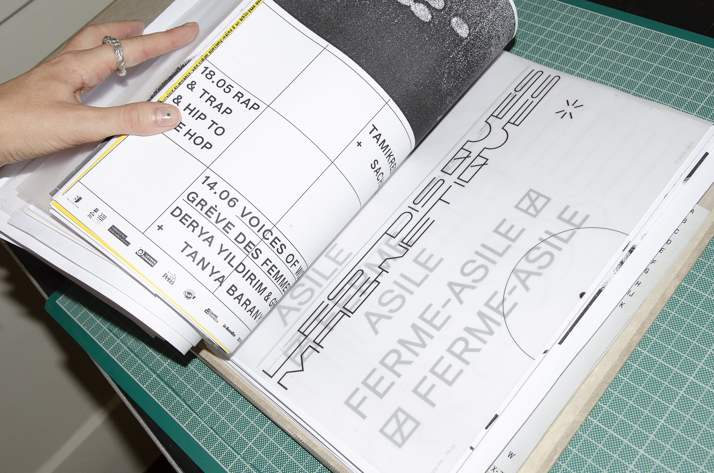
Chloé Pannatier’s mission comes to this, creating a sense of identity in a visual fashion for tangible objects in the likes of album artwork design or posters for events promoting cultural content. Despite seeking inspirations from different disciplines, Chloé declares her main profession as that of a graphic designer. A Valaisan born, Lausanne based self-described interdisciplinary practitioner, Chloé became independent two years from graduating from the ECAL in 2015 after a series of successful design related project opportunities in London as well as in the Cantons of Valais, Vaud and Geneva. Affiliated with an organisation called La Syndicale, Chloé main mandates revolved around events and poster design. However, the pandemic lead to an obvious decrease in requests for poster design, thus making her current activities becoming more focused towards album artworks for Swiss labels in the likes of Cheptel or Bongo Joe records, whether on vinyl or digital formats.
On this day, Chloé takes a break from designing totebags and posters for an upcoming project to be released in September for Le Port Franc, a concert venue in Sion. In this transcribed piece titled "Synesthesiac nourishment in pursuit to create identity", we discuss her upbringing, different strategies to create value in physical and digital art, the influence of ongoing trends and the application of her environmental surroundings in servitude to her works.
[.....] How would you describe your work?
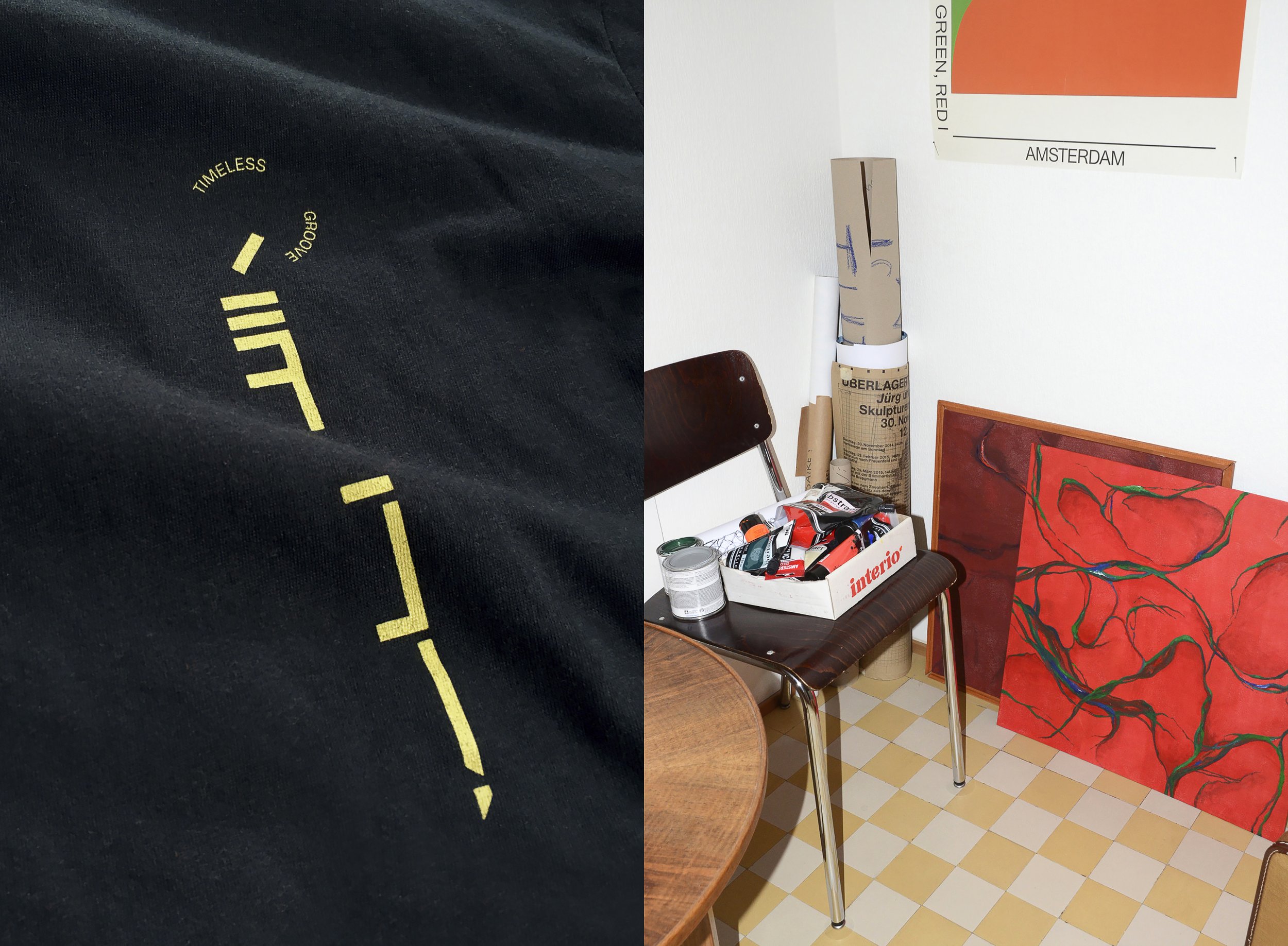
When you asked me to have this chat, it’s true that when you do projects after projects, you do not necessarily take a step back to observe your progression. Talking to you gave me the opportunity to take a step back and reflect on all of my works side by side that I have accumulated throughout the years.I’ve noticed two distinct axes that I would forefront to describe my work. The first being the concept signs; symbols and typography, quite concrete. A written statement usually in a focused bold and black. The other axe relates more to a personal synesthesiac application of textures, colours, and shapes. It’s more of a sensorial experience. Similar to how one would make music, adding sounds and effects, I like to layer things on top of each other until something special happens. Translating sound into visuals is one of the most common exercises you get to do during art school. I have moved away from trying to represent sounds in terms of rhythm, sound waves etc. into a more personal, synesthesiac interpretation. It also helps me avoid typical genre aesthetics building my own practice.
One thing for sure that I always incorporate in my work is to preserve a sense of identity. Whether it is a project for a band or a poster for a gig or museum, it does not matter, my preference stands equally. I like to create a unique universe that underlines the sense of identity of who or what I am referring to. Oftentimes, the visual side is the first thing you see, so it is important for me to set the pace and vibe of what the rest of the project has to offer, whether the music of an album or the poster for an event, especially when I can have it evolving over time. This reason also made me want to extend my work in designing book edition covers.
A recurring upbringing that my graphic designers friends share is that they started out with photography. What is your relation with it?
In my case, I would not consider myself a photographer per se. But I do use my smartphone’s camera a lot. I like to document my surroundings for later use. I could not tell you whether this is related to my process of graphic designing or just because I belong to a generation that pretty much always had a camera on their phone at disposal. But in any way, the repetition of taking so many pictures creates a relation between myself and the concept of image which eventually translates to patterns or textures I could apply for a project I might be working on.
Where do you draw your inspirations from?
It’s difficult to pinpoint the genesis of your inspirations because a lot of it is out of instinct or subconscious. Nevertheless, a big source of my inspirations come through my regular attendance at local gigs. There’s a very healthy, creative scene of great people, mindsets and approaches out here that are ideal in nourishing your mind. I find that this reflects into my work, an amalgamation of what i see, share and experience that is stored in my subconscious and thus generates ideas from being exposed to so much music, gig posters, people and so on. This creative environment becomes immersive and synesthesiac which allows me to break away from the very traditional and specific “rules” that are applied sometimes in Swiss graphic design.
The project “il Sogno di Carmen” by Pascal Viscardi & Alano Santo is precisely that. They incorporate a lot of balearic sounds in their music. Where there’s a very strong aesthetic for that genre, I wanted to avoid diving in completely. We had a great talk with Alain and Pascal, they shared a lot of stories around their project, their sound, their dreams, then I translated these narratives into my idea of what that could look like. So it refers to balearic in a way, there are some elements like the sun in water for example, but it’s a personal take on it. When Covid started, I spent the first three weeks at home developing the EP visual into a video for their track “Ulan Bâtie” and textures in motion.
L’Éclair’s “Confusions” is another example. I have been listening to the tracks from the very beginning, to fit their music in a visual context so that they may respond to each other adequately. I was very fortunate to be able to attend some of their recording sessions that were located in a farm hidden in the mountains, even before knowing I would end up doing the artwork for the album. Staying with them for a few days gave me a better idea of instruments they used to generate the sounds featured on the album, even work process and life moments are telling something of the output. Afterwards, I made use of this sensorial perception of their music since I saw the album in question being constructed and gave me additional insight into their process. I also involved great talking with them, of narratives around moments in life, evolving, translating into complex, vibrant and nocturnal sounds. It was short and challenging to be commissioned a painting, but I really applied these elements from what I have witnessed into the album you see before you.
Now that your name is being featured more and more on different projects, specifically music related ones, do you find yourself to be more selective in who you work with, or do you thrive on the diversity of challenges that might be proposed to you?
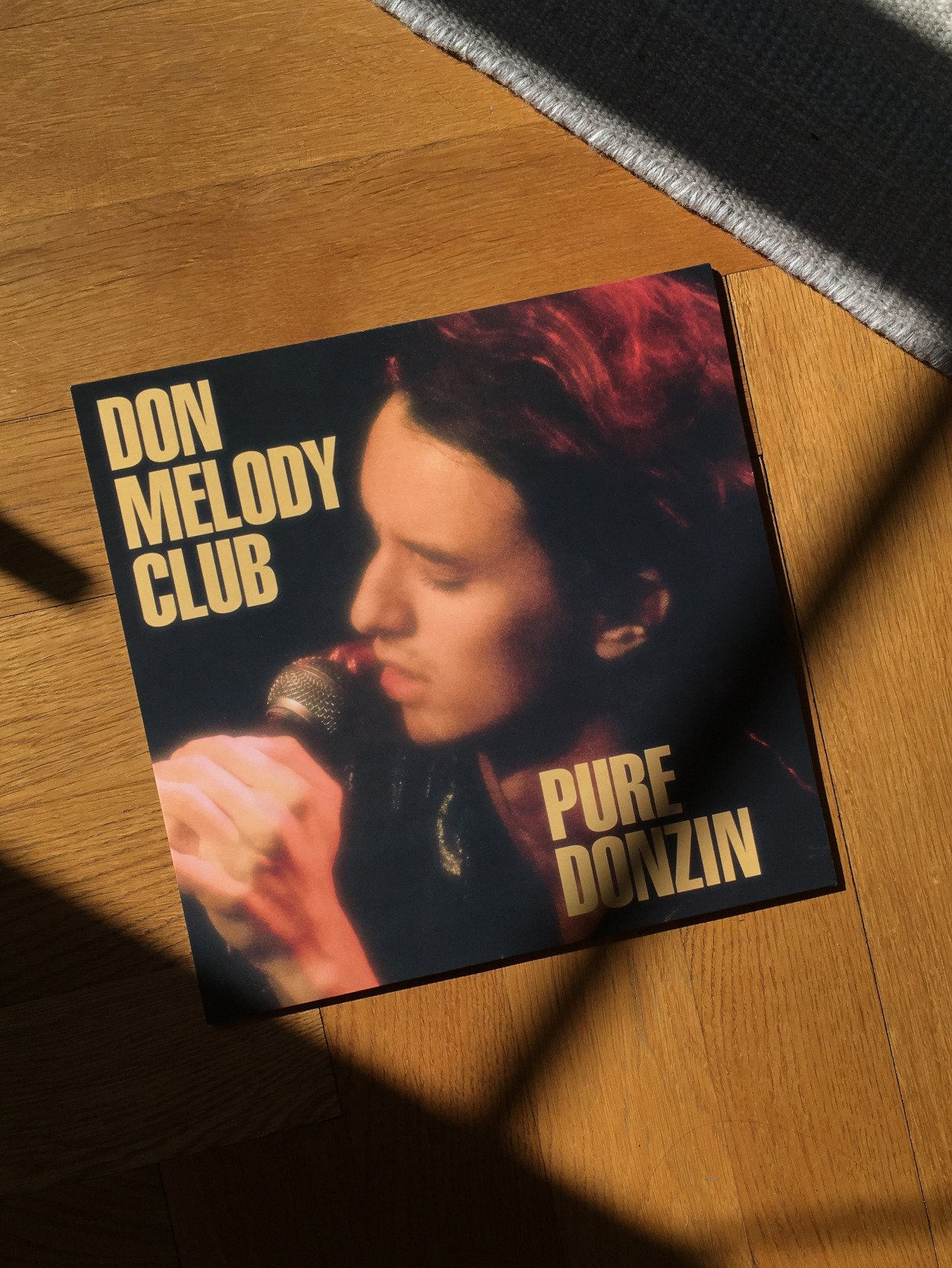
I like to work based on feeling, whether the project or the person that gave me a mandate. Don Melody Club’s album for Bongo Joe records for example, I never met or heard the project before. In this case, Donald had a pretty specific idea and mind and some material ready, the music spoke to me immensely also, so I was curious to explore this direction which was very different from my usual process. I (almost) never refused requests, but timing plays a huge part in it, such as myself being available for work since sometimes I already have quite a lot of stuff going on already.
Your work with bands at times is quite collaborative yet also lead by instructions. How do you find working based on self initiation as opposed to a brief?
When you're initiated by brief it's more of an application of what you know to a certain amount of specificity based on the request of the client. When you self initiate a project, I get out of my repertoire of knowledge and rather try a process I always envisaged in trying, thus resulting in something I never made before. The approach for self initiation really comes from the desire to use new tools from disciplines that make you inquisitive in applying them into your own work. For example, lately I had a project that was completely free form and coincidentally had inherited lino printing plaques from a friend. It has been a while that I had them yet never made use of them, therefore it made sense to try out this technique and potentially incorporate it in my toolbox of skills. The filter that I made for L'Éclair in support of their LP is another good example of self initiative on my behalf to appease my own curiosity. The tool itself necessarily reveals unexpected qualities or flaws that both can be embraced. It’s only to my advantage that I look to explore different artistic endeavours.
Therefore having worked on record sleeves means that there is a musical and visual side. Is there anyone you would like to work on a project that is purely on the visual side?
My friend Zoé Cornelius is someone I would like to collaborate with. She’s a great artist and person and her thinking really vibrates and resonates in a unique way. Going back to what we spoke about seeking diversity for challenges, I would love to work with a visual artist because I have never done this before. It would allow me to get out of my usual work habits and reach inwards myself on a more personal reflective matter that could only make me develop other skills. To manoeuvre a personal process by working with someone who has a vision on things that is unique, and thus could be used for me to think out of the box within my creative involvement by working with someone else. This said, regarding making use of new techniques, I also have a fascination for quilting which I have been doing more and more; funnily enough, that’s actually a creative endeavour I’d like to pursue with Zoé for example, as I believed it would make a great collaborative trajectory to investigate.
It’s always good to switch it up to avoid creative blocks I find.
Exactly. I also make music with a friend of mine, but it is to say that all of these practices feed into each other and bring something unique that you can take from. I find that after all, my process stays the same, even if these disciplines have nothing to do with each other but can intertwine. It’s a matter of applying different layers that eventually connect and generate “a-ha” moments that make your art special, reshaping and reshaping things until something special happens. It’s this approach of superposing where all of the sudden, and you don’t know why, colours start to vibrate, contrast becomes evident, a tension is met… that makes it interesting to preserve and then push it further.
Going a bit back to what you mentioned regarding staying up to date, do you try to follow trends?
Something that I find particularly difficult with being a designer is that you have to be very reactive yet focused. Especially with the rise and prominence of social media, you are exposed to a lot more work and other talented individuals and trends come and go much faster, so much so as rapidly as they are conceptualised. That said, I do incorporate some trending elements in my works because I do belong to my era no matter what, I’m part of ‘now’, I don’t want to mimic a past era, or fake styles and approaches that were produced by tools that we do not use any more. It is important for me to not only stay true to my style, my techniques and methods, but my work also has to relate to contemporary styles and be relevant with what is happening around you, stylistically speaking. Therefore to better myself as a designer means i have to keep a healthy balance of the two; awareness and self development.
Why do you think trends move so quickly then?
I find that the concept of locality and the underground scene dissipating a bit to some extent because of the growth in technology making trends less grounded to a local scene or movement, but rather to the world wide web directly. Since we have access to so much content, it’s easier than ever to draw inspiration from the work of an artist based in Amsterdam who was then influenced by someone’s work in New York. The lines are getting blurred from their origin. However, many artists such as myself have also graduated from schools that focus on a style or art that has been ingrained in its cultures for decades. Swiss typography or graphic design is something quite unique, although replicated in various cultures, I make use of it myself since it served as my educational background. And this core is what never leaves. The trends surrounding it come and go quickly because they do not stick as much due to its speed of diffusion, whether related to social media algorithms or not. There’s a globalisation of using tools and techniques that if reached high in popularity, means we will get bored of it a lot quicker due to over exposure and seeing it everywhere.
All and all, these fast moving trends make me focus on myself. I am very careful of not getting too wrapped up in these trends because I like reflecting on my work in a few years time, such as today. It is important for me to make sure I do not see my works as “has-been”s or something “so 2020”, whilst having it be a clear personal snapshot of my artistic growth. And yet I have to live in my times, day and age by using the tools at my disposal, often the exact same that my peers do.. It does take place in my aesthetic, and therefore use this concept to nourish my process, while staying true to my core and upbringing. I stay quite loyal to Swiss design since I studied at the ECAL. There is a history of codes and styles and applications of typography that I am still very attached to. It’s very rigorous, meticulous, which stays a lot with my work, although I do a lot of psychedelic elements, it goes back to what I was telling you before regarding applying the two axes into my work, traditional and sensorial. To respect the influence of Swiss design that is still obviously relevant to this day.
Can you elaborate on strategies you have found to create equal value in both digital and physical formats?
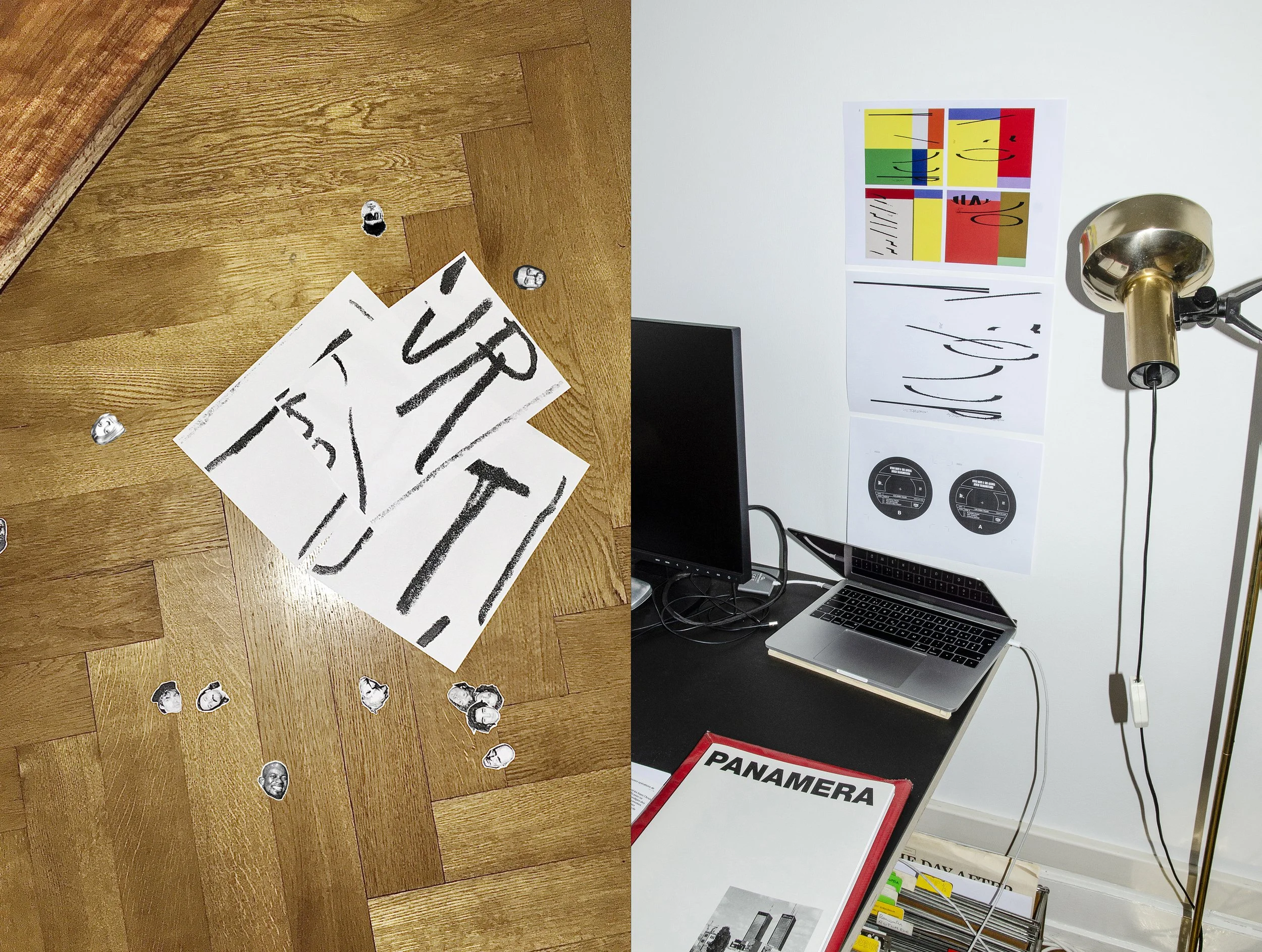
I actually love the LP sleeve format and find it extremely powerful. Having a square template is actually quite anti-graphic design because it is difficult to express tension and to prioritise certain aspects due to its restricted space. But to have a sleeve in your hands has an aspect of rigidness and has a sense of durability, as much as for the vinyl disc or the artwork. Although I get mandates or projects that make me work on the computer a lot, I am very happy that I got other LP sleeve design gigs that allowed me to have a more analog approach. For example, the instructions for the artwork for Bongo Joe records “Futur Antérieur'' requested me to use all of the involved musicians’ faces to be part of the sleeve. I felt that for this task, it did not make sense to make a collage of faces in InDesign. So this resulted in me printing all of the artists' heads (around eighty) and cutting their heads to have their faces featured and reconstruct them in a way that made visual sense, all whilst avoiding sneezing on them as that would mean I would have to restart from scratch.
In this case, when handling something that will be on a physical medium, there is the use of a more physical approach during the conceptualisation of the artwork. I like to print out demos and prototypes to have a better idea how mandates for physical objects would render itself in real life. Since I like archiving my work a lot, I started compiling all of these ‘tests’ in a folder so I can see the progression of things during my process, going back and forth and pursuing a direction that I liked at one point. It’s also a way to review and spot connections in my works.
When it comes to giving value for artwork that would only appear digitally, my approach is not fundamentally different. The shape of the artwork remains square. Even so sometimes I merge both realms; designing the artwork in an analogue fashion then rendering it digitally. A project that comes to mind is “Hyper In” by Perrine 3000 , where she had a friend that has a screen printing studio. So I got to use it for some prints, although it was only going to be a digital release.
As you probably know, with analog or a physical approach, it means that you are restricted to certain points. Although the vinyl industry is standardised when it comes to its artwork format (specific inks, paper texture, size), I have had projects that involved printing on certain types of paper, printing techniques, which means i have to be more careful in my approach and selective with the type of colours i want to used, as it does not render equally the same across the various papers and such. To elaborate, some projects at Bongo Joe are printed at Stefano’s a friend of Cyril’s (founder of Bongo Joe) who had an atelier in Legno, Italy. At this location, we could use special inks and paper. There’s an upcoming album actually that will be printed on kraft paper. But these projects are not common at all and come in small prints. As you can imagine, despite it being physically beautiful, it is more technical to print and therefore increased the cost of production. It is to say that with all this in mind, you have more of a clearer end goal in what you are trying to accomplish and thus are more thoughtful with your design choices. In the digital realm, you are a lot liberated in a different way to explore and try out things due to its speed, flexibility and cost efficiency.
In your graduation project back in 2015, you talk about fantasies of gambling players, their obsessions, the way they pick numbers. What are yours and do you still incorporate such elements in your work?
Yes absolutely. The constant repetition of my process is my obsession, as something evolves everytime you create something. At times it grows quickly, other times slowly. At the end of my studies, I was already starting to develop my style with a set of rules or systems which I can always go back to. I like that today, when I apply my repertoire of tools onto a project (as per mentioned throughout this chat), that my style is developed enough to be the basis of my work. With all of these elements in place, it can generate a lot of other ideas. So I always have a point of reference that I can develop further, play around with.

